05 — In use
Applications
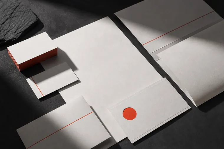
Stationery suite
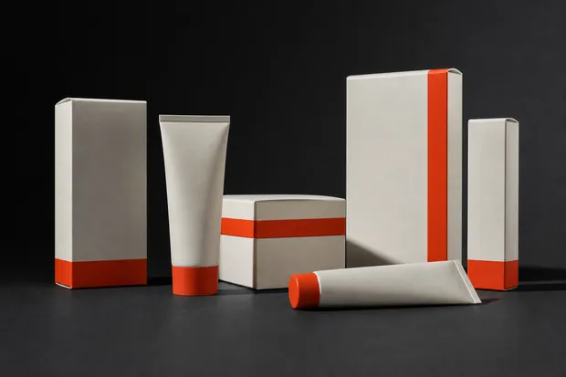
Packaging system

Campaign print
An extract from a real handover document. This is what a client receives at the end of a brand identity engagement.
Primary · on charcoal
Inverse · on bone
Signal · single colour only
| Clear space | Equal to the height of the aperture dot on all four sides |
| Minimum digital | 96px wide |
| Minimum print | 22mm wide |
| Never | Stretch, outline, add shadow, or place on a busy image without a scrim |
One signal colour, used at under ten percent coverage on any given surface. The restraint is the identity — the moment red appears twice on a page it stops meaning anything.
The identity was drawn to animate. The aperture dot is the pivot for every transition — it opens to reveal, closes to cut, and travels between scenes as the only element that never leaves the frame.
| Default easing | cubic-bezier(.19, 1, .22, 1) |
| Entry duration | 600–900ms |
| Exit duration | 240–360ms — always faster than entry |
| Stagger | 90ms between sibling elements |
| Never | Bounce, elastic, or anything over 1200ms |
Live: the studio easing curve, looping
Stationery suite
Packaging system
Campaign print