pantry
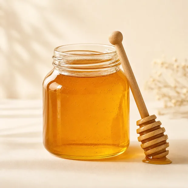
Raw Wildflower Honey
Unfiltered, unheated, from hives on the west meadow.
★★★★★(301)
$14.00
The tokens, components and rules the whole brand is built from. This is the document we hand over at the end of a UI/UX engagement.
Earth tones with one warm accent. Every pairing below meets WCAG AA for body text.
Fraunces for anything with a voice, Karla for anything with a job.
Primary is forest green and turns clay on hover — the one deliberate colour shift in the system. Radius is always fully rounded. Every button lifts 2px on hover.
Focus rings use sage at 18% opacity. Errors use clay, never pure red.
Unfiltered, unheated, from hives on the west meadow.
Yes, from your account, up to midnight two days before the delivery.
Leave it out when you build the box.
A 4px base. Sections breathe on a fluid clamp between 52 and 104 pixels.
Organic shapes carry the brand: the hero image uses an arch, section joins use a hand-drawn wave rather than a straight edge.
Nothing sits on pure white or pure black. Cream and ink keep the page calm on a screen at 6am.
The interface stays quiet so the produce can be the loudest thing on the page.
Arches, waves and full-round buttons. Nothing about a farm is a rectangle.
"Picked this morning" beats "farm-fresh quality produce" every time.